3.18 Lab 2: Basic Plots
Related Reading: IDS 9.4 (if you are interested, you can read IDS Chapters 6-10 for much more information about plotting in R)
In this lab, I’ll introduce you to some basic plotting. Probably the most common type of plot that I use is a line plot. We’ll go for trying to make a line plot of average income as a function of education.
To start with, I’ll introduce you to R’s ggplot2 package. This is one of the most famous plot-producing packages (not just in R, but for any programming language). The syntax may be somewhat challenging to learn, but I think it is worth it to exert some effort here.
# load ggplot2 package
# (if you haven't installed it, you would need to do that first)
library(ggplot2)

# load dplyr package for "wrangling" data
library(dplyr)
# arrange data
plot_data <- us_data %>%
group_by(educ) %>%
summarize(income=mean(incwage))
# make the plot
ggplot(data=plot_data,
mapping=aes(x=educ,y=income)) +
geom_line() +
geom_point(size=3) +
theme_bw()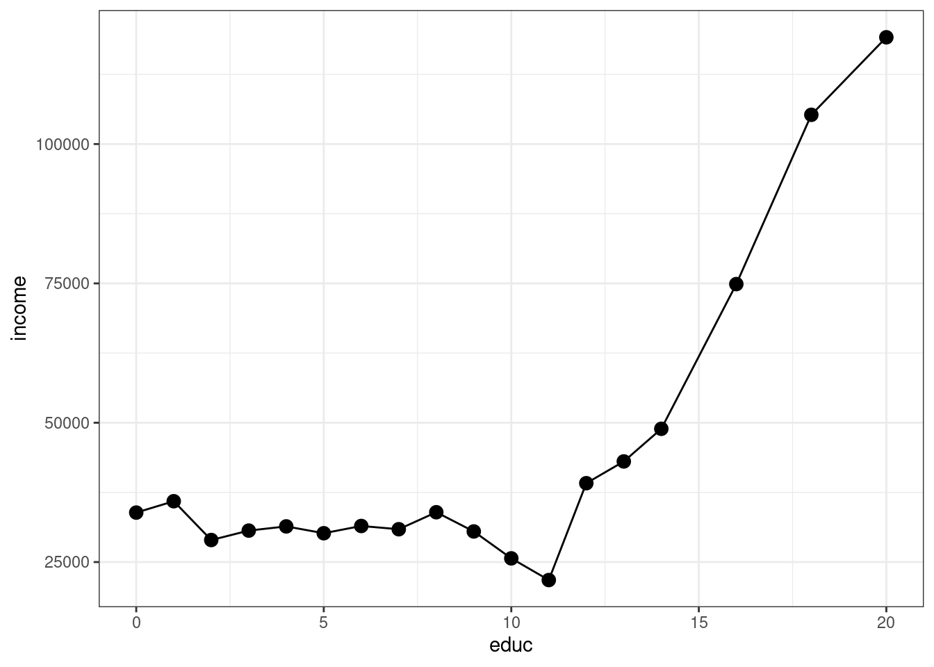
Let me explain what’s going on here piece-by-piece. Let’s start with this code
At a high-level, making plots often involves two steps — first arranging the data in the “appropriate” way (that’s this step) and then actually making the plot.
This is “tidyverse-style” code too — in my view, it is a little awkward, but it is also common so I think it is worth explaining here a bit.
First, the pipe operator, %>% takes the thing on the left of it and applies the function to the right of it. So, the line us_data %>% group_by(educ) takes us_data and applies the function group_by to it, and what we group by is educ. That creates a new data frame (you could just run that code and see what you get). The next line takes that new data frame and applies the function summarize to it. In this case, summarize creates a new variable called income that is the mean of the column incwage and it is the mean by educ (since we grouped by education in the previous step).
Take a second and look through what has actually been created here. plot_data is a new data frame, but it only has 18 observations — corresponding to each distinct value of education in the data. It also has two columns, the first one is educ which is the years of education, and the second one is income which is the average income among individuals that have that amount of education.
An alternative way of writing the exact same code (that seems more natural to me) is
# arrange data
grouped_data <- group_by(us_data, educ)
plot_data <- summarize(grouped_data, income=mean(incwage))
If you’re familiar with other programming languages, the second version of the code probably seems more familiar. Either way is fine with me — tidyverse-style seems to be trendy in R programming these days, but (for me) I think the second version is a little easier to understand. You can find long “debates” about these two styles of writing code if you happen to be interested…
Before moving on, let me mention a few other dplyr functions that you might find useful
filter— this is tidy version ofsubsetselect— selects particular columns of interest from your datamutate— creates a new variable from existing columns in your dataarrange— useful for sorting your data
Next, let’s consider the second part of the code.
# make the plot
ggplot(data=plot_data,
       mapping=aes(x=educ,y=income)) +
    geom_line() +
    geom_point(size=3) +
    theme_bw()
The main function here is ggplot. It takes in two main arguments: data and mapping. Notice that we set data to be equal to plot_data which is the data frame that we just created. The mapping is set equal to aes(x=educ,y=income). aes stands for “aesthetic”, and here you are just telling ggplot the names of the columns in the data frame that should be on the x-axis (here: educ) and on the y-axis (here: income) in the plot. Also, notice the + at the end of the line; you can interpret this as saying “keep going” to the next line before executing.
If we just stopped there, we actually wouldn’t plot anything. We still need to tell ggplot what kind of plot we want to make. That’s where the line geom_line comes in. It tells ggplot that we want to plot a line. Try running the code with just those two lines — you will see that you will get a similar (but not exactly the same) plot.
geom_point adds the dots in the figure. size=3 controls the size of the points. I didn’t add this argument originally, but the dots were hard to see so I made them bigger.
theme_bw changes the color scheme of the plot. It stands for “theme black white”.
There is a ton of flexibility with ggplot — way more than I could list here. But let me give you some extras that I tend to use quite frequently.
In
geom_lineandgeom_point, you can add the extra argumentcolor; for example, you could trygeom_line(color="blue")and it would change the color of the line to blue.In
geom_line, you can change the “type” of the line by using the argumentlinetype; for example,geom_line(linetype="dashed")would change the line from being solid to being dashed.In
geom_line, the argumentsizecontrols the thickness of the line.The functions
ylabandxlabcontrol the labels on the y-axis and x-axisThe functions
ylimandxlimcontrol the “limits” of the y-axis and x-axis. Here’s how you can use these:# make the plot ggplot(data=plot_data, mapping=aes(x=educ,y=income)) + geom_line() + geom_point(size=3) + theme_bw() + ylim=c(0,150000) + ylab("Income") + xlab("Education")which will adjust the y-axis and change the labels on each axis.
Besides the line plot (using geom_line) and the scatter plot (using geom_point), probably two other types of plots that I make the most are
Histogram (using
geom_histogram) — this is how I made the plot of the pmf of education earlier in this chapterAdding a straight line to a plot (using
geom_ablinewhich takes inslopeandinterceptarguments) — we haven’t used this yet, but we will win once we start talking about regressionsIf you’re interested, here is a to a large number of different types of plots that are available using
ggplot: http://r-statistics.co/Top50-Ggplot2-Visualizations-MasterList-R-Code.html
Side Comment: Base
Rhas several plotting functions (e.g.,plot). Check IDS 2.15 for an introduction to these functions. These are generally easier to learn but less beautiful than plots coming fromggplot2.