devtools::install_github("shommazumder/binscatteR")Exercise 2a Solutions
For this problem, we are going to use a difference-in-differences identification strategy to estimate the causal effect of a continuous treatment. The data that I am providing below is simulated data, but it has broadly similar features to the data used in the application in Callaway, Goodman-Bacon, and Sant’Anna (2023) which comes from Acemoglu and Finkelstein (2008) which considers the effect of a Medicare policy in the 1980s that reduced reimbursement rates to hospitals specifically for labor expenditures. The outcome variable is the capital-labor ratio, and (roughly) the theoretical argument in their paper is that the policy could alter the capital/labor mix in hospitals, and that these effects could vary across hospitals that had differential exposure to the policy (where exposure is based on the fraction of Medicare patients in the period before the policy was implemented).
Here is information about installing and loading packages that could be useful in this problem.
library(ggplot2)
library(binscatteR)
library(np)
Additional Code
I should mention that code for DID with a continuous treatment is not nearly as well developed as some of the other cases that we have considered previously. Therefore, I’m directly providing some functions that you may find useful below. The first function computes weights from a TWFE regression with a continuous treatment (these are the same weights that we talked about in our session today).
#' @param l a particular value of the treatment for which to compute weights
#' @param D an nx1 vector containing doses for all units
cont_twfe_weights <- function(l, D) {
  wt <- ( ( mean(D[D>=l]) - mean(D) ) * mean(1*(D>=l)) ) / var(D)
  wt
}
The second function provides a way to nonparametrically estimate causal effect parameters with a continuous treatment.
#' nonparametric estimates of att(d|d) and acrt(d|d)
#' @param dy the change in the outcome over time
#' @param dose the amount of the treatment
#' @return list(
#'            local_effects - data frame containing the dose and estimates of
#'              att(dose) and acrt(dose)
#'            att.overall - an estimate of the overall att
#'            acrt.overall - an estimate of the overall acrt
#'          )
cont_did <- function(dy, dose) {
  # choose bandwidth
  bw <- np::npregbw(formula=dy ~ dose,
                regtype="ll",
                bws=1.06,
                bwscaling=TRUE,
                bandwidth.compute=FALSE)
  # estimate att and acrt nonparametrically
  out <- np::npreg(bws=bw, gradients=TRUE, exdat=dose)

  # order from smallest to largest dose and drop untreated
  this_order <- order(dose)
  dose <- dose[this_order]
  dy <- dy[this_order]
  att.d <- out$mean[this_order]
  acrt.d <- out$grad[,1][this_order]
  att.d <- att.d[dose>0]
  acrt.d <- acrt.d[dose>0]
  att.overall <- mean(att.d)
  acrt.overall <- mean(acrt.d)

  return(list(local_effects=data.frame(dose=dose[dose>0],
                                       att.d=att.d,
                                       acrt.d=acrt.d),
              att.overall=att.overall,
              acrt.overall=acrt.overall))
}
Data and Data Generating Process
You can load the data by running
load("medicare1.RData")It contains the following columns:
hospital_id- the hospital identifierd_capital_labor_ratio- the change in the capital labor ratio for a hospital from 1983 to 1985, this is the (change in the) outcome variablemedicare_share_1983- the fraction of medicare patients in the hospital in 1983, this is the continuous treatment variable.
Here are the first few rows of the data
head(medicare1) hospital_id d_capital_labor_ratio medicare_share_1983
1 1 1.0801008 0.6575648
2 2 0.7099469 0.3040419
3 3 0.8776760 0.6135562
4 4 0.9431500 0.4825248
5 5 0.6435963 0.7852173
6 6 0.9563133 0.4610489Remember this is simulated data, so we can also go ahead and get a sense of what the answers to the questions below “ought” to be (we will see how well various approaches can deliver them below.)
To start with, I generated the data where \(ATT(d|d)\) is given as in the following plot:
dose <- seq(.01,.99,by=.01)
ATT <- -4*(dose-.5)^2 + 1
p <- ggplot(data.frame(ATT=ATT, dose=dose), aes(x=dose, y=ATT)) +
    geom_line() + ylim(c(0,2))
p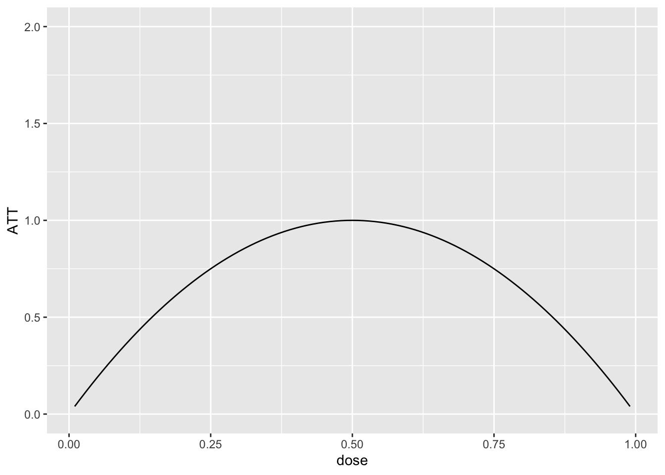
And this implies that \(ACRT(d|d)\) is as is given in the following plot:
ACRT <- -8*(dose-.5)
ggplot(data.frame(ACRT=ACRT, dose=dose), aes(x=dose, y=ACRT)) +
  geom_line() + ylim(c(-6,6))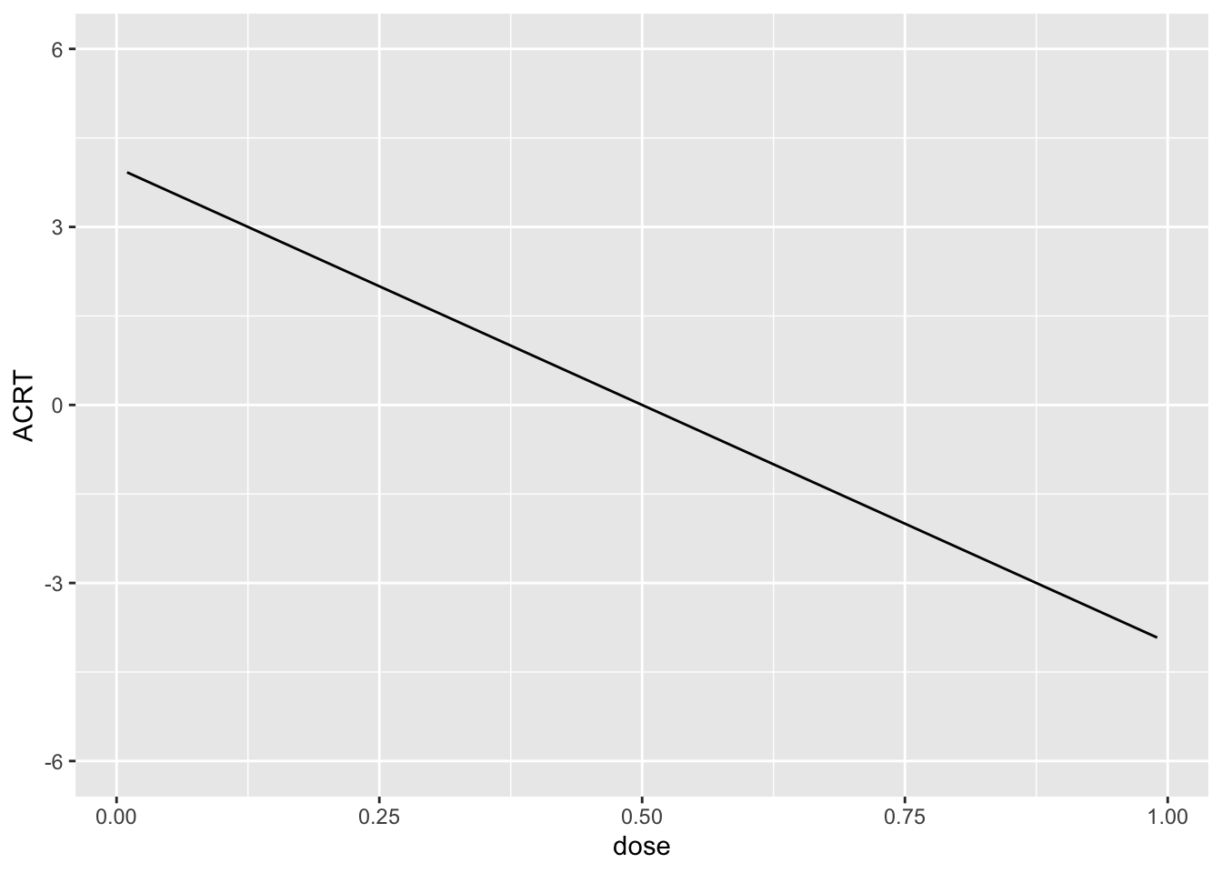
I drew the data so that there is a 10% chance of a hospital being untreated and then, among treated hospitals, I drew the dose from a normal distribution with mean 0.5 and standard deviation of 0.16. Since this is symmetric about 0.5, it implies that \(ACRT^O=0\) by construction. We will see how well we can replicate this using different approaches below.
Question 1
Plot a histogram of the the dose. What do you make of this?
Solutions:
dose <- medicare1$medicare_share_1983
dy <- medicare1$d_capital_labor_ratio


p <- ggplot(data.frame(dose=dose), aes(x=dose)) +
     geom_histogram()
p
`stat_bin()` using `bins = 30`. Pick better value with `binwidth`.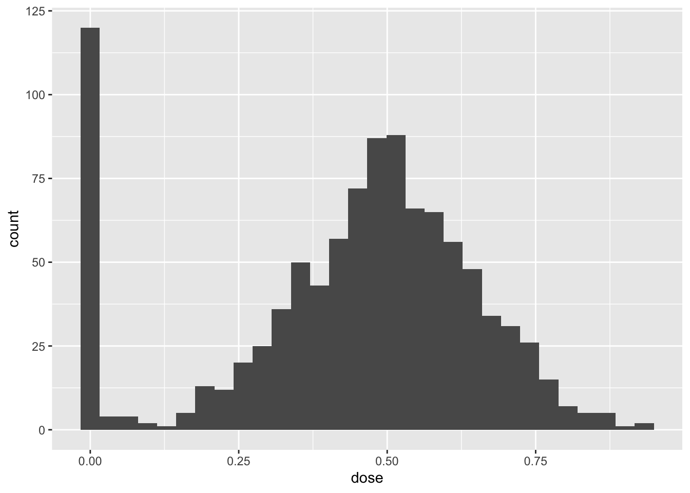
The histogram show that a non-trivial fraction of units are untreated while common values of the treatment are around 0.5 and this decreases as we move towards the 0 and 1. This is in line with the data generating process described above.
Question 2
Make a binscatter plot of the change in the outcome over time with respect to the dose. What do you make of this?
Solutions:
binnedout <- binscatter(data=medicare1, x="medicare_share_1983", y="d_capital_labor_ratio")
binnedout
$plot_out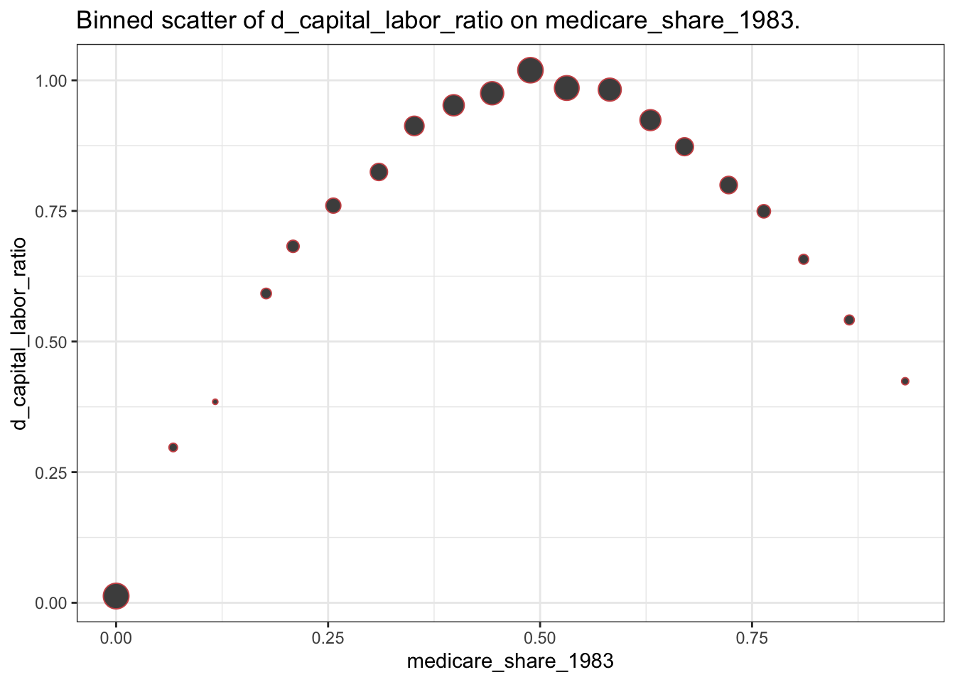
$binned_df
# A tibble: 20 × 8
   xbinned   meanoutcome seoutcome      x lower_95 upper_95 sizebin outcomelabel
   <fct>           <dbl>     <dbl>  <dbl>    <dbl>    <dbl>   <int> <chr>
 1 (-0.0009…      0.0128  0.000882 0        0.0111   0.0146     124 d_capital_l…
 2 (0.0466,…      0.297   0.0323   0.0673   0.234    0.361        5 d_capital_l…
 3 (0.0933,…      0.385   0.0544   0.117    0.278    0.491        2 d_capital_l…
 4 (0.14,0.…      0.592   0.0123   0.177    0.568    0.616       10 d_capital_l…
 5 (0.187,0…      0.682   0.00811  0.209    0.666    0.698       16 d_capital_l…
 6 (0.233,0…      0.760   0.00326  0.256    0.754    0.767       30 d_capital_l…
 7 (0.28,0.…      0.825   0.00237  0.310    0.820    0.829       44 d_capital_l…
 8 (0.327,0…      0.913   0.00177  0.352    0.909    0.916       61 d_capital_l…
 9 (0.373,0…      0.952   0.00138  0.398    0.950    0.955       76 d_capital_l…
10 (0.42,0.…      0.975   0.00109  0.443    0.973    0.977       96 d_capital_l…
11 (0.466,0…      1.02    0.000769 0.489    1.02     1.02       121 d_capital_l…
12 (0.513,0…      0.985   0.000775 0.531    0.984    0.987      113 d_capital_l…
13 (0.56,0.…      0.982   0.00115  0.582    0.980    0.984       94 d_capital_l…
14 (0.606,0…      0.924   0.00154  0.630    0.921    0.927       74 d_capital_l…
15 (0.653,0…      0.873   0.00210  0.670    0.869    0.877       49 d_capital_l…
16 (0.7,0.7…      0.800   0.00271  0.722    0.794    0.805       45 d_capital_l…
17 (0.746,0…      0.749   0.00581  0.764    0.738    0.761       21 d_capital_l…
18 (0.793,0…      0.657   0.00899  0.811    0.640    0.675        8 d_capital_l…
19 (0.84,0.…      0.541   0.0178   0.865    0.506    0.576        8 d_capital_l…
20 (0.886,0…      0.424   0.0528   0.931    0.320    0.528        3 d_capital_l…
This picture is closely related to the plot of \(ATT(d|d)\) provided earlier. The size of the dots also reflects the distribution of the dose that was discussed in Question 1.
Question 3
Run a regression of the change in the outcome over time on the dose. What do you make of the results?
Solutions:
twfe <- lm(dy ~ dose)
summary(twfe)$coefficients
Estimate Std. Error t value Pr(>|t|)
(Intercept) 0.3273579 0.01715088 19.08695 1.776977e-69
dose 1.0794670 0.03501614 30.82770 3.804918e-147If we were hoping to estimate \(ACRT^O\), then we did not do it well here: recall that \(ACRT^O=0\), but here the coefficient on the dose is 1.08 and strongly statistically different from 0.
Question 4
Use the cont_did function provided above to estimate the \(ATT(d|d)\), \(ACRT(d|d)\), \(ATT\), and \(ACRT^O\). Plot \(ATT(d|d)\) and \(ACRT(d|d)\) as functions of the dose and provide estimates of \(ATT\) and \(ACRT^O\).
Solutions:
cont_res <- cont_did(dy, dose)
cont_res$att.overall
[1] 0.9032416cont_res$acrt.overall[1] 0.04110219plot_df <- cont_res$local_effects
colnames(plot_df) <- c("dose", "att", "acrt")
ggplot(plot_df, aes(x=dose, att)) +
geom_hline(yintercept=0, color="red", linetype="dashed") +
geom_line() +
theme_bw()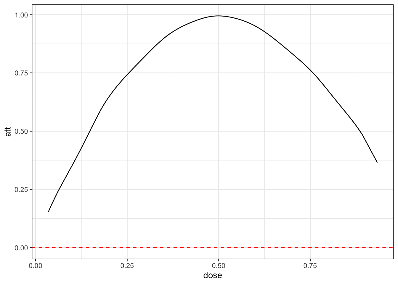
ggplot(plot_df, aes(x=dose, acrt)) +
  geom_hline(yintercept=0, color="red", linetype="dashed") +
  geom_line() +
  theme_bw()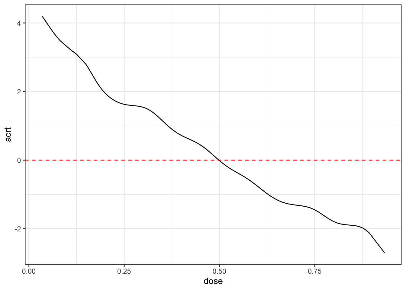
These estimates are in line with the data generating process that we described above. Note also that acrt.overall is much closer to 0 than what we got with the TWFE regression.
Question 5
The following plot provide an estimate of the density of the dose. How is this plot related to the estimate of \(ACRT^O\) from Question 4?
Solutions:
#-----------------------------------------------------------------------------
dL <- min(dose[dose>0])
dU <- max(dose)
# density of the dose
dose_grid <- seq(dL, dU, length.out=100)
frq_weights_plot <- ggplot(data.frame(dose=dose[dose>0]), aes(x=dose)) +
  geom_density(colour = "darkblue", linewidth = 1.2) +
  xlim(c(min(dose_grid), max(dose_grid)))+
  ylab("Density weights") +
  xlab("Dose") +
  ylim(c(0,3)) +
  labs(title="Density of dose")
frq_weights_plot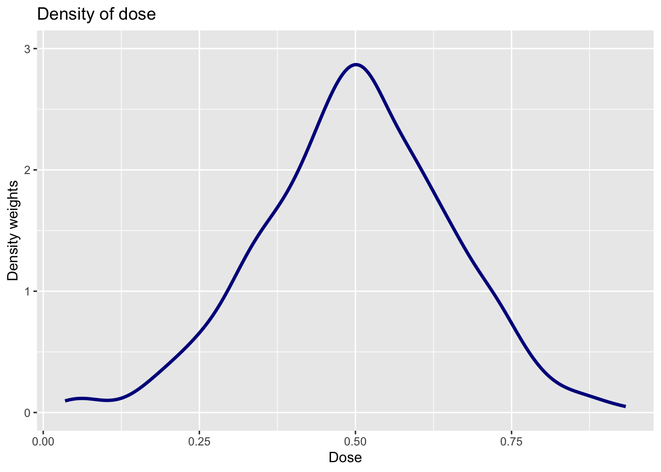
The density of the dose effectively serves as the weights on \(ACRT(d|d)\) to deliver an estimate of \(ACRT^O\). Here you can see that values of the dose near 0.5 get the most weights — this makes sense as these doses around 0.5 are more common than doses closer to 0 or 1.
Question 6
Use the function cont_twfe_weights provided above to create a plot of the TWFE weights as a function of the dose. How is this plot related to the result from Question 3?
Solutions:
twfe_weights <- sapply(dose_grid, cont_twfe_weights, D=dose)

plot_df <- cbind.data.frame(twfe_weights, dose_grid)

twfe_weights_plot <- ggplot(data=plot_df,
                            mapping=aes(x = dose_grid,
                                        y = twfe_weights)) +
  geom_line(colour = "darkblue", linewidth = 1.2) +
  xlim(c(min(dose_grid),
         max(dose_grid)))+
  ylab("TWFE weights") +
  xlab("Dose") +
  geom_vline(xintercept = mean(dose),
             colour="black",
             linewidth = 0.5,
             linetype = "dotted") +
  ylim(c(0,3)) +
  labs(title="TWFE weights")

twfe_weights_plot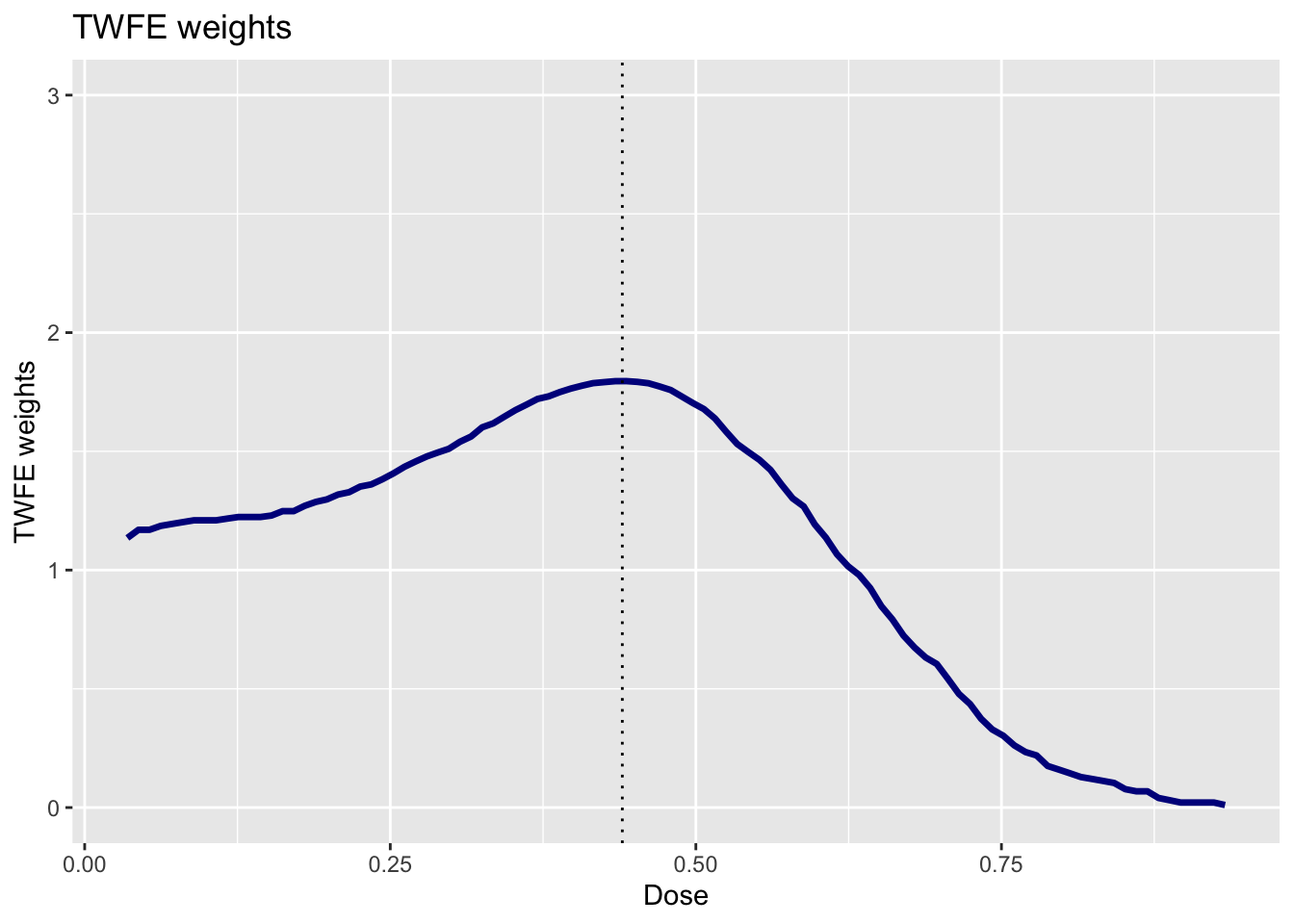
These weights explain why we get so much different results from the TWFE regression relative to the nonparametric approach. The TWFE regression puts substantially more weight on low values of the dose. We know that the \(ACRT(d|d)\) was larger for small values of the dose. Therefore, if we put more weight on those values of the dose, then we will get a larger estimate of the summary measure — this is exactly what is happening with the TWFE regression.